30 Jul A more intuitive treemap?
We find tree maps an extremely helpful way for people to see a big picture of a situation made up of many granular parts. With skillful application of color palettes, coloring and sizing metrics, it can be easy for people to get an overall sense of a situation, and help answer questions like: Is the big picture good or bad? Which items are doing best and which are doing worst? One of the best features of a treemap is that you can see a large number of items at a glance, perhaps several thousand, without any one being obscured by another.
The treemap was invented in the early 1990s by Ben Shneiderman at University of Maryland College Park. Since then, the basic structure of the treemap has not changed much, although several different tiling algorithms have been developed.
The treemap has become popular in recent years for many different types of applications, which attests to its versatility and general applicability. When we talk to people who don’t know what a treemap is, we still point to the excellent Map of the Market implementation which was developed originally by Martin Wattenberg in the late 1990s. Often people we talk to have seen treemaps before, but they just didn’t know that that’s what they are called. I wish there were a different name for a treemap because a tree seems to suggest to most people something branching, more like:
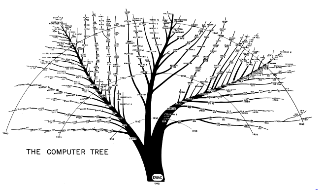
But that is a tree diagram, not a treemap.
Treemaps, in any case, are now available as part of many commercial graphing toolsets and javascript charting libraries, further increasing access and popularity.
The basic treemap concept has many strengths. However it also has a few weaknesses that, I think, prevent it from being as useful as it might be. The main problem, I believe, is that as values in the underlying data change, any particular ‘asset,’ or rectangle, may move to a different position on the map, making it hard for a person to keep track of individual assets as they change over time. An asset’s position is hard to control in a treemap, because it is determined by the layout algorithm used to position the assets within the overall containing rectangle of the chart. Fundamentally, there seems to be a tradeoff that all tiling algorithms contend with. It has to do with two competing goals:
1. Getting the aspect ratio of a particular asset’s rectangle to be as close to square as possible.
2. Keeping the position of the asset stable and ordered.
Although different algorithms put varying degrees of priority on one or the other of these goals, to the extent that they attempt to keep the position of an asset stable, they all (so far as I have seen) focus on positioning assets by size, not by color. This, I think, is an oversight. Have a look at the following chart:
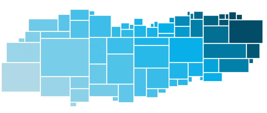
We designed this to try to help people quickly determine the best options for decisions that involve cost, value and size. For example, imagine that each rectangle represents a financial asset you are thinking about purchasing for an investment. Size is how much is available to buy, and color represents the value-to-price ratio, where darker is a more desirable investment. Simply put, you are looking for large rectangles that are darker blue. How do you find the best candidates? Easy, right? Start from the top right and work your way to the bottom left until you’ve spent all your investment budget. Now try to find the best candidates in this chart:
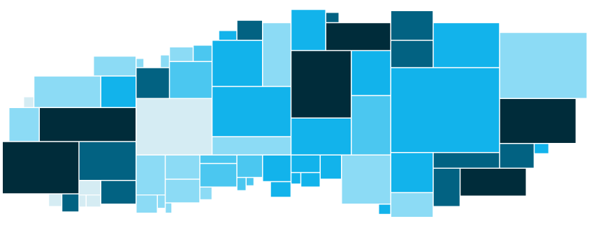
A little harder to do, right? When I try to do it, my eyes have to go all over the map to find the assets I want. I can do it, it’s just a little more work.
I would not argue that the type of chart shown in Fig. 1 above, which for the moment I’ll call a color-prioritized treemap, is better than a standard treemap for all types of operations. However, for applications where you are trying to simultaneously see a large bucket of options at a glance, and also see things in a prioritized order, I do think this type of chart is more useful.
Realizing this design as a web-based interactive chart, so far as we have been able to tell, is still a custom coding project. We haven’t seen a way yet to create it using standard treemap charting tools, but we’re working on it now. Anyone interested in helping or working with us, or knows a javascript library that could be useful for this, please let me know.
Linked below are some free and open source resources for data visualization that may be helpful:
- DVUX Reading List
- D3.js
- Charted
- Google Data Studio
- Leaflet JavaScript Library
- My Heat Map (Free to use for public maps)
- RawGraphs.io (Import spreadsheets to create data visualizations)
- Silk Visualization Tool
- Color Brewer (Generates color schemes)