02 Feb Design is more than making things look pretty
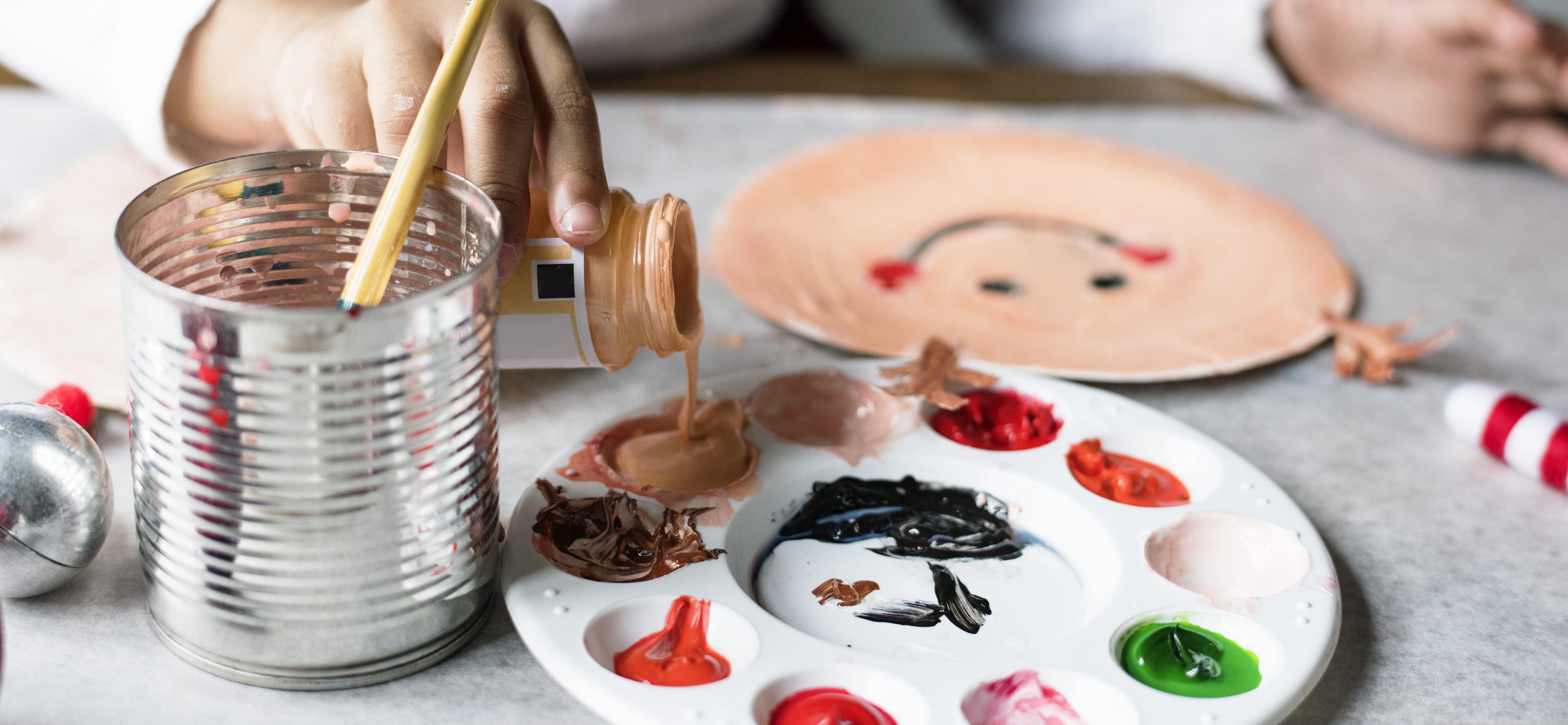
“Just make it look pretty” may be an appropriate phrase for a teacher to use when referring to a child’s finger-painting assignment, but it is often mistakenly used when referring to Design, what we do and how we help. Yes, part of our work involves making things look nice; however, that is not what drives ultimate design decisions. User research/testing, personas, and question boards are a few things that lead to a successful design.
Before we can even begin designing, we first must understand who the user is. If we are creating an app for seniors to track appointments and medications, we must not forget that it is for seniors. We need to keep in mind color palettes, font choice, and size that allows the best contrast for readability. Also, recognizing our users when selecting appropriate iconography and images is vital as something can easily be deemed inappropriate and cause discomfort for the user. In this case, specific features like connecting on social media, although can be a trendy or cool feature to have, may not have much value for the user. Having a simple messaging or chatting component would be more appropriate for the user as they can contact their care provider if they have any question or concern about a medication they are taking.
A perfect example of making something look pretty, but forgetting to keep all of the users in mind is Facebook’s Year In Review. It was an update intended to bring back happy memories to the users. It had a featured image with celebratory illustrations all around to mark the excellent year one had. However, Facebook failed to consider all of their users as not all of them had a great year worth celebrating. So although the illustrations were pretty, it quickly became inconsiderate to specific users – thus making it an unsuccessful feature and in need of a redesign.
Illustrator: Naomi Wilkinson
Something that is attractive is often uncluttered, and it’s functional and not distracting.
For a design to be successful, the strategic placement of content and features are essential to the user’s journey/flow, and it should answer the critical questions the users are asking. In our process, we begin with question boards (a series of questions a user may ask while using the product/site that leads to the development of strategic wireframes) to make sure that our designs are resolving the problems that the users have. For example, if a user is in full panic mode on their way to the emergency room and needs to look up where they should go or what they need before getting there, they should be able to access the hospital’s website and find the answer to their questions as soon as possible. If the user accesses the site and a video of a joyful child greets them followed by a timed ad causing them to struggle to see the information they need, the video immediately becomes an obstacle, thus making the website lack efficiency and usability.
Whenever possible, the design should closely reflect the established question board to avoid creating an unusable site or a dreadful experience. In the previous case, forgetting to keep the user’s critical needs in mind when finalizing the website led to the user feeling more anxious and decreased the probability of that user returning.
As designers, we quickly learn that “pretty” isn’t enough to make a product or website successful. Before anything, the product must serve a purpose, answer the right questions, and help the user accomplish what they need to without disrupting their experience.