
29 Apr Hooked: Data Visualization and User Motivation
When designing data visualizations, many practitioners focus on what is the right type of chart or visual metaphor to display a particular data set. It certainly makes sense to focus on the point where the user is interacting with, and trying to make sense of data. However, I would suggest that what happens before and after a user views a visualization is often equally, if not even more, important.
Let’s say that a user gains an insight from a visualization that helps her solve a problem she has been working on. How does she turn that insight into some kind of meaningful action? In many cases, the answer is straightforward: she makes a decision, or maybe instructs someone to take an action based on what she learned.
In business scenarios where decision-making is often based on Key Performance Indicators (KPIs), business scorecards and dashboards, it is common to make decisions like adjusting budgets, delaying or funding projects, or reallocating resources based on data insights. The decision can sometimes seem to be an almost automatic consequence of the insight.
But in other contexts, simply gaining an insight from a visualization is often not enough to convert that understanding into some kind of useful or meaningful action. In these cases, the user’s motivation to act is critical to the next step in the process. This often comes into play when the data being visualized causes an emotional reaction (fear, suspicion, dread) on the part of the viewer. It seems simple enough if we know what to do with the information, but what happens when we don’t really *want* to do what is required to solve the problem.
Imagine that you are trying to get more exercise, and you are wearing a fitness tracking device. Often you feel excited to try to reach your goal of 10,000 steps per day. But sometimes, say after a tough day at work, you’d rather just sit on the sofa, have a drink and watch something on TV. Your fitness tracker’s progress updates—”8000 steps, only 2000 more to go!” may seem like a motivator, or something you’d just as soon ignore, depending on how you’re feeling.
To try to understand the lifecycle of motivation, and how data visualization might fit into it, our team has been looking at two models we think are helpful to understanding user engagement—the Hook model from Nir Eyal, and Bartle’s character types.
The Hook model is described by its author as a model for creating “habit-forming products”. The model is based on the notion that humans crave novelty—immediate and variable feedback from actions we take. The Hook lifecycle has 4 parts:
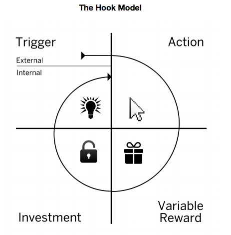
Trigger
The prompt to action, known as the Trigger, can be either external or internal. Initially, as a cycle is taking hold, it is typically external—a reminder appearing on your mobile device’s home screen, say. Over time, the trigger may be internalized, becoming something you do out of habit and don’t have to be prompted to do anymore, like checking your Facebook or Twitter app for updates.
Action
Eyal defines Action as the “the simplest behavior done in anticipation of a reward.” Tapping a Facebook app icon, or scrolling through a Pinterest feed to see more pictures, are examples.
Variable reward
A reward can be something very simple, like seeing a new message, or some new Pinterest pictures you haven’t seen before. The variable part, I think, is key. If you don’t quite know ahead of time what the reward will be, the prospect of surprise can be hugely tantalizing, even if the payoff is nothing particularly extraordinary.
Investment
By putting a small increment of effort, or investment, into the experience, the likelihood of your returning to the experience increases. Eyal explains, “…when users add friends, set preferences, or create content they want to save, they are storing value in the platform. Storing value in a service increases its worth the more users engage with it, making it better with use.”
A data visualization experience can function within the Hook lifecycle in several ways:
- It can serve as a variable reward, providing the user feedback via a chart or graph, of actions s/he has taken. For example, my activity trend over the last week, or a graph of how many times I’ve logged into an app each day.
- An interactive data visualization can contain both the action *and* variable reward steps of the cycle. For example, a data visualization that has an interactive slider, so that the visualization changes when you move the control, can provide its own variable reward—what will the graph look like when I slide the control over here?
- A visualization can be a trigger, like in the fitness tracker example. Seeing a graph showing you have achieved 9250 steps so far today, with a little gap at the top representing the 750 steps still needed to reach your goal, may be just enough to get you off the sofa.
Designing experiences that incorporate data-driven graphic displays into the Hook cycle is not simple—it typically requires a thorough understanding of your user and their motivations, and can often involve some deep analytics. But if the payoff is getting people to really use the product and get value from the insights you can offer them, we think the investment is worth it.