22 Apr Pattern Recognition & Uncanny Data
A recent article in the New York Times cited new research that suggests we are more alert to patterns when we have seen, or experienced, something odd or uncanny. These disorienting experiences “may prime the brain to sense patterns it would otherwise miss,” writes Benedict Carey, the article’s author.
This reminded me of a phenomenon I have struggled to describe, but which I have been interested in for some time. There is a state of heightened awareness we are all familiar with. It happens after you see something interesting or intriguing that you can’t quite figure out. For example, as you walk by a building, you happen to look through a glass door and see a car idling in what looks like the lobby of the building. Wait a minute, you think after taking another step or two, what’s a car doing in the lobby of that building? You stop and step back for another look and realize that what you thought was a lobby is in fact the courtyard of the building. These misapprehensions occur every day and we probably for the most part easily forget them. As you were walking by the building, maybe you had been thinking about some emails you have to answer, people you need to call, things to get at the store on your way home, whatever. As soon as that odd visual presented itself to you, however, nothing was as interesting as figuring out what was going on. During the moment when you were trying to resolve that confusion, everything else flew out of your mind.
What was going on in that example? The context—the way the building presented itself to the street, the style and size of the glass door, etc.—all suggested to you that what you would see when you looked through the door is a typical building lobby. What you did see, however, violated that expectation. Or perhaps more precisely, your brain thought it had enough information to make a decent assumption, but you suddenly learned that it did not have sufficient information to make the particular assumption that a lobby stood behind the glass door. If reality had aligned with our expectation—if you had seen an ordinary lobby behind the door—you wouldn’t have given it a second thought and may not even have noticed that you had seen the door or lobby at all. On the other hand, if the door hadn’t looked like such a lobby door, or if the building hadn’t looked so much like other buildings on that street—all of which have lobbies—your brain might have reckoned that it didn’t have enough information to make any assumption at all about what was behind the door. You wouldn’t have had any expectation that the space was anything in particular. So seeing a car there probably wouldn’t have surprised you. It was the disconnect between your assumption of what you would see, and what you did see, that created that state of heightened awareness.
Why spend so much time on an example like this? Three reasons:
1. A state of heightened awareness is valuable, so it’s helpful to understand what may produce it
2. I have an unconfirmed suspicion that this example is related to effective reporting and visualization of data
3. I like odd and uncanny stuff like this
For now, I’ll focus on #2.
I think the link between my example above and data visualization has to do with pattern recognition. Consider these propositions:
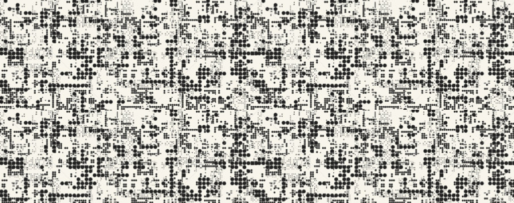
Case 1: Too much data.
This is chaotic and overwhelming. We are unable to discern a recognizable pattern, so we do not make any assumptions about what the data tells us.
Case 2: Too little data.
This is boring. We barely notice that there is useful information there at all, and don’t even bother to discern a pattern or make assumptions.
Somewhere in the middle—where the amount of data is about right—I suggest there are two possibilities:
Case 3: The amount of data is about right.
The pattern is clear and easy to recognize. We instantly understand the situation.
Case 4: The amount of data is about right.
There seems to be a pattern. Maybe the pattern is not what we expected to see. Maybe it’s difficult to make out or understand the pattern. Either way, we want to learn more to figure out what’s going on.
How does this relate to reporting and visualization? Here are my thoughts:
Case 1 & Case 2
= Not useful
Case 3
= Useful reporting.This gives you an answer to a question you have asked.
Case 4
= Useful data visualization/exploration. This gives you insight, allowing you to ask more questions.