01 Feb How the Whiteboard Inspired Our New Website
When we started discussions about our website redesign, the challenge was understanding where to begin and how to approach the project. We had a current website to work off of but we weren’t fully satisfied with how it conveyed us as a company—it covered the basics but it didn’t get at the heart of how and why we do the work that we do.
Getting started
Internally, we know the empathy and expertise that we have as a team and why we approach projects the way we do, but the challenge was how to present this and tell our story to others.
So we went back the basics. We revisited our mission, business goals, and marketing goals. Making these concrete helped to outline the goals and actions for our new website.
We wanted our site to do the following:
- better reflect who we are, what we do, and how we work
- curate the presentation of our work to reflect the consideration we put into our work
- be representative of our design process and expertise
- introduce our team
- motivate new potential clients to start a conversation with us
- be a platform for us to share our voice in the industry
We jumpstarted the process by creating collections of words and phrases that best described the company and what we do, visual design inspiration from other websites, and we started an ongoing conversation about our company values.
Designing for yourself is hard.
The highest priority for us was to truly have our personality come through. This meant putting a lot of thought into what our primary message is and how that would inspire and inform the design.
One would think this would be a no-brainer because who knows you better than you know yourself? But designing for ourselves just meant that we knew we had to get it right, which made it challenging.
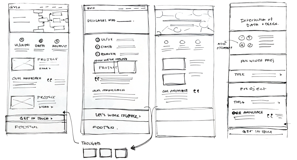
We took a stab at it and created multiple variations of our homepage, each by a different designer with their own take on the look and feel, as well as the language.

Some of my initial sketches when concepting the homepage
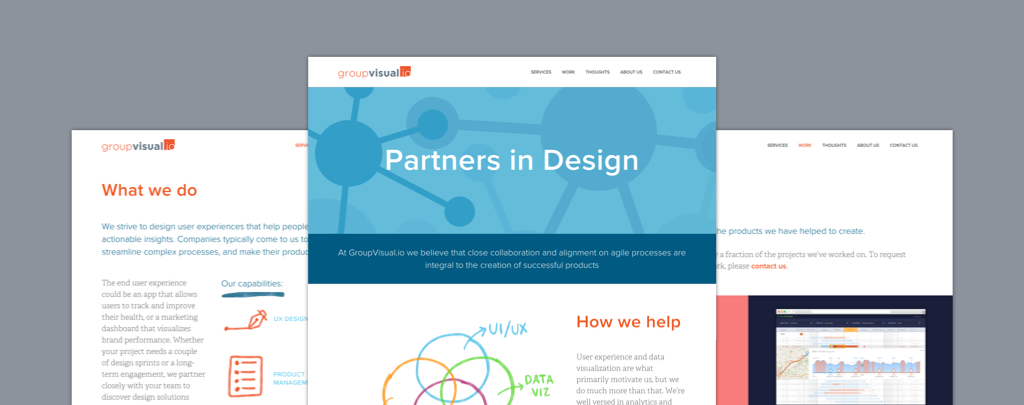
As a team, we reviewed them and chose the most fitting — this concept introduced the message “partners in design” and had a hand sketch quality to it on graph paper. We then discussed how to iterate on this concept and push it forward to feel even more like us.
At GVio, we use an agile design process, which encourages collaboration with our clients and incorporates design cycles, reviews, and iterations. Every project starts on a whiteboard and every step after usually revisits it at some point. You could say, aside from our computers, it is our most important tool — the temporary aspect of a whiteboard promotes iteration. It encourages creativity, collaboration, curiosity, problem solving, and exploration…This is how we work, so why not have it drive the look and feel of our website.
To the whiteboard (literally)
Establishing this concept gave us a lot of momentum to push the project forward. We continued to gather and write all of the content and work on the site structure — including primary messaging, describing our process, and curating case studies. Design iterations continued in parallel, which focused on how to best incorporate the feeling of a whiteboard into the design.
The whiteboard needed to have a balance with the rest of the design — we wanted the feeling to come through but not call too much attention to itself to the point where it was overpowering. This meant finding the right places to incorporate the whiteboard and then the right medium for creating the illustrations and details.
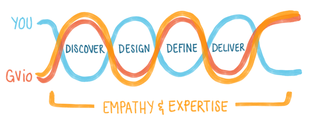
The illustrations seen on our website went through many cycles before they felt right. In the end, the iPad and Pencil was our answer. This allowed enough control over the drawing, color, and legibility, while still feeling like an authentic whiteboard.

Early pass at illustrating our process

Final process illustration
Our work doesn’t end here—we plan to continue to maintain and build upon our site. We feel this is a good foundation for where we want to take it in the future.
On that note, we hope you enjoy taking a look at our new website!
