Enabling aquarists with better monitoring of their complex ecosystems
Mobile App | Dashboard
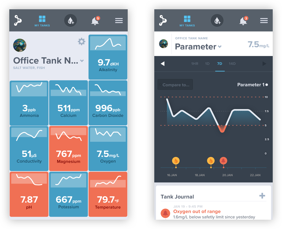
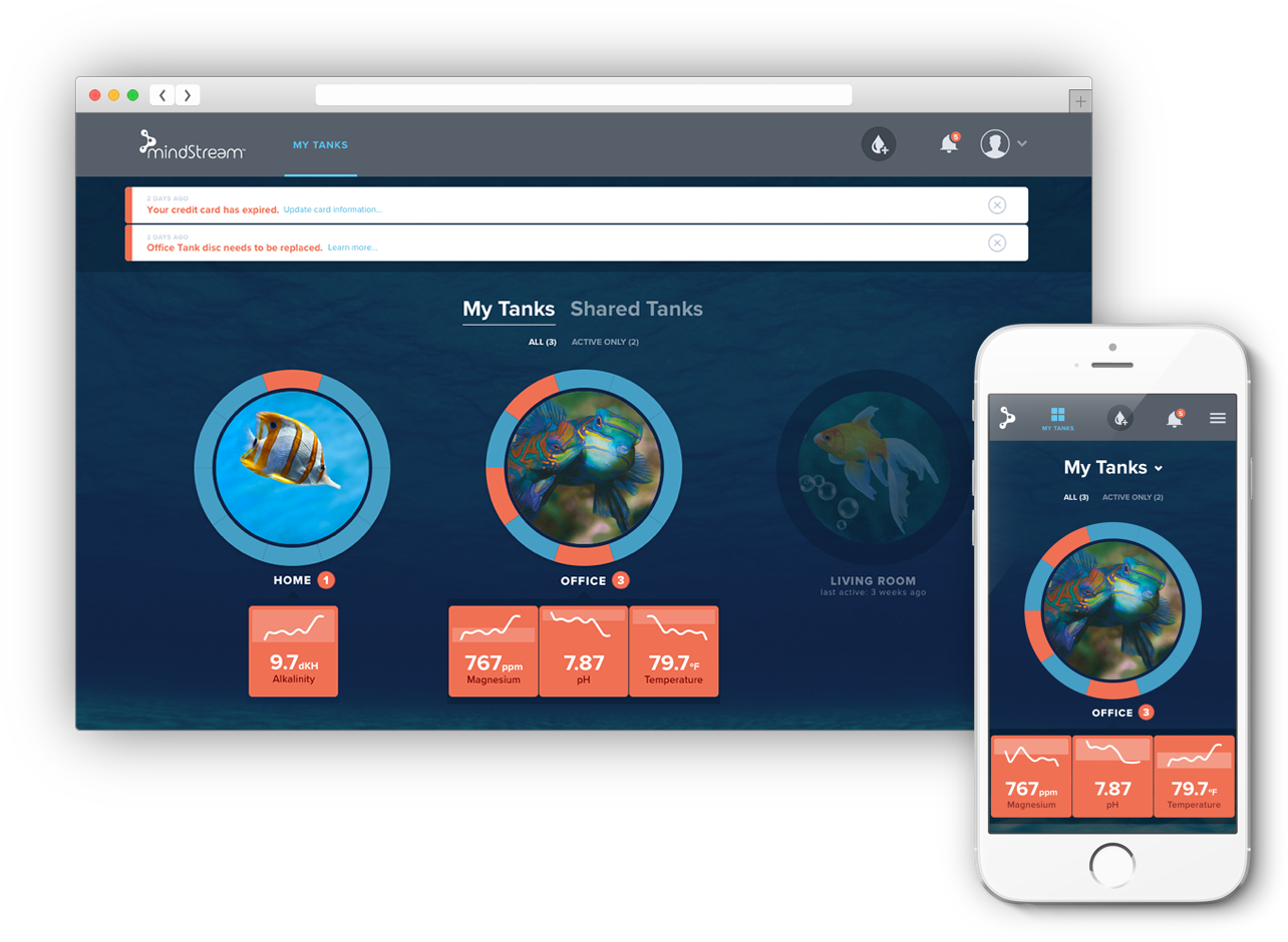
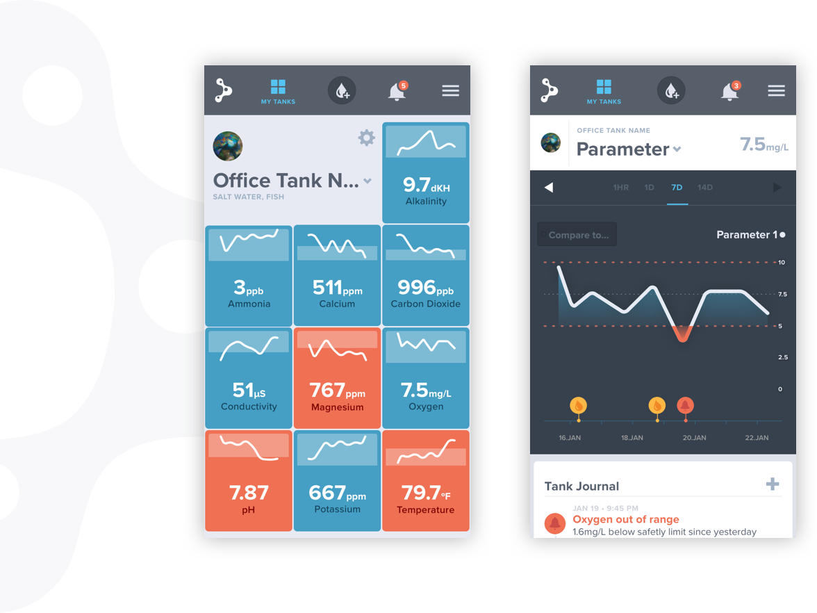
Designed for aquarists, MindStream™ technology’s product streamlines the process of testing fish and coral tank water. Incoming data from the tank monitor is stored in an application that allows the aquarist to gather insights, log events, and check the status of their tanks on the go.
Challenge
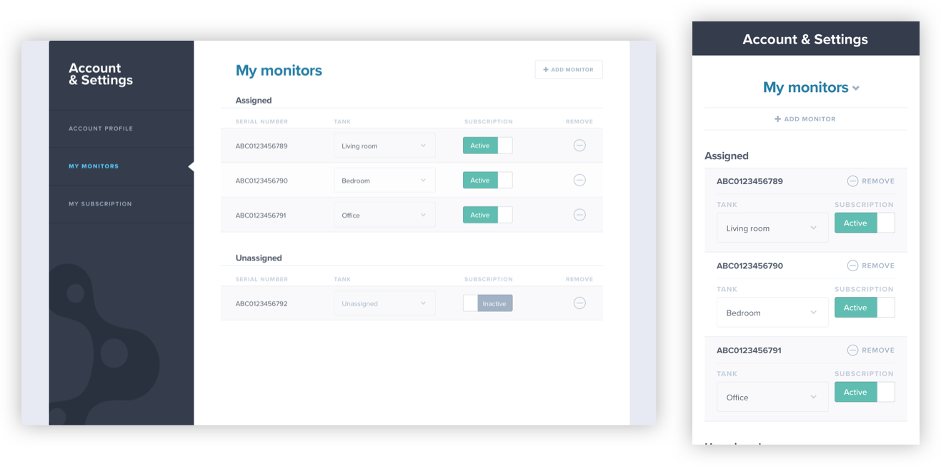
Aquarists needed an intuitive setup, a modern UX, and an information architecture that organized the data in a meaningful way. The app needed scalability to support multiple devices and to eventually accommodate entire systems of tanks. Another consideration was making the UI colorblind-friendly. Meanwhile, demand for the product was tremendous. To meet high demand and stay ahead of competition, we sought to deliver the MVP as soon as possible.



Major Focus areas:
- Define the user flow of the application
- Identify the key screens and how they break down into multiple levels of detail

Approach
We spent some time interviewing an aquarist as our subject matter expert to gain a sense of what was most important to them in the app. After this research, we spent time defining the key screens and the level breakdowns of each parameter.
After speaking with future users and the team at Mindstream, we knew we wanted to maintain a friendly aesthetic. Many aquarists use their tanks as a soothing and relaxing pass time, we wanted to carry that feeling throughout the application for a more holistic experience.
Solution
The final deliverables were an MVP that accomplished the user goals set during the discovery phase. We were able to define a workflow that matched the aquarists’ priorities.

Key deliverables:
- Initial prototype
- Defined sitemap + workflows
- Annotated sketch files


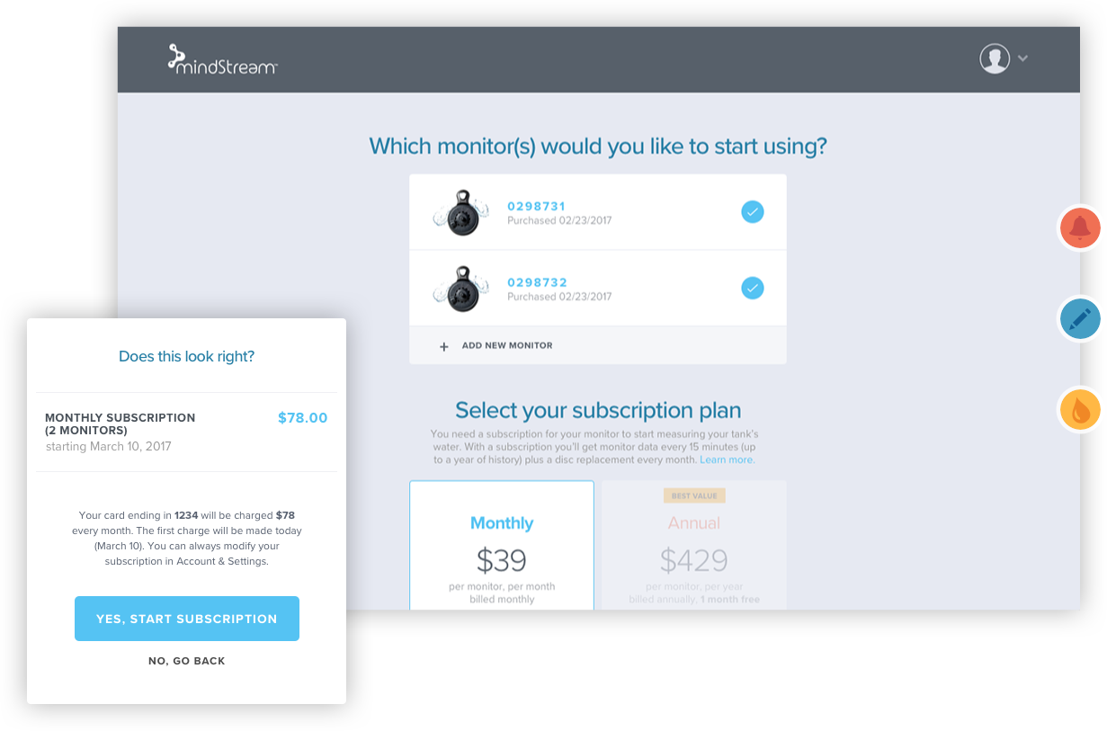
The result was an onboarding process with user account configuration plus support for the physical setup of the monitor. It followed the natural course of the initial UX events: setting up the monitor, installation, and finally account configuration.
 |
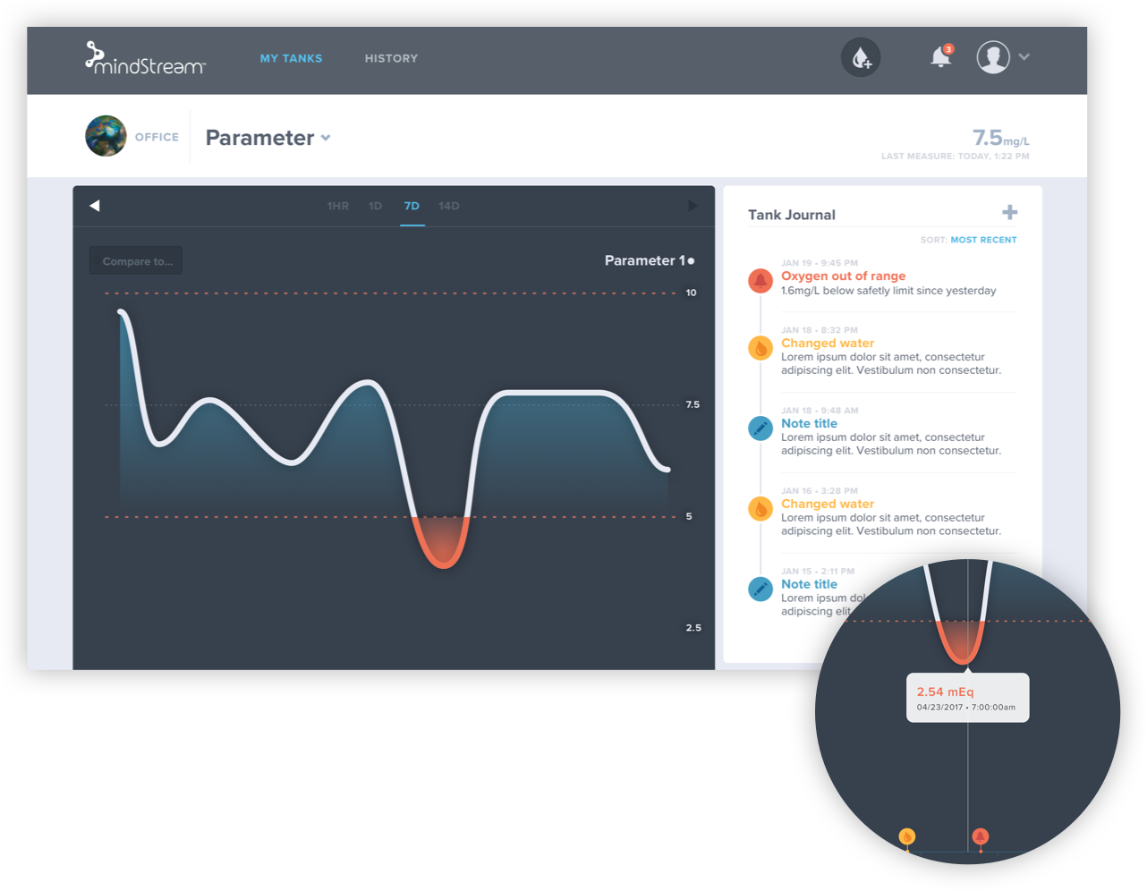
Quick Events gave deeper context than text-based notes. Users could view their events as flags on a timeline. |

 |
Quick Events gave deeper context than text-based notes. Users could view their events as flags on a timeline. |

We designed a comparison feature that allows the user to overlay one parameter over the other. We also added “Did you know?” facts to each parameter. This helped educate new users by giving them more context around each parameter.
