28 Sep Does your product help your customer think better?
Our goal at GroupVisual.io is to help product leaders create products that enable people to think more effectively and make better decisions. As a result, we think a lot about thinking, and how to promote higher-quality cognition and reasoning.
Any meaningful decision involves tradeoffs
Product teams wrestle with product decisions on a daily basis. We have come to recognize that every meaningful decision inevitably involves tradeoffs. Why? Because in a world with constraints (the world most of us live in) resources are limited, and we need to decide among which resources to deploy in any particular effort. What resources are we referring to? The scope of any real-world project will be limited by time and budget.
From a cognitive perspective, though, the key resources we need to treat judiciously in any product experience are our user’s attention and working memory, as well as perhaps their emotional energy.
The really interesting and challenging tradeoffs often involve choosing between having a good thing, vs avoiding a bad thing. Or deciding which of two different good things we prefer. In a product design context, this could involve, for example, deciding whether to produce a product experience that is precise and matter-of-fact, or one that tries to be friendly and encouraging.
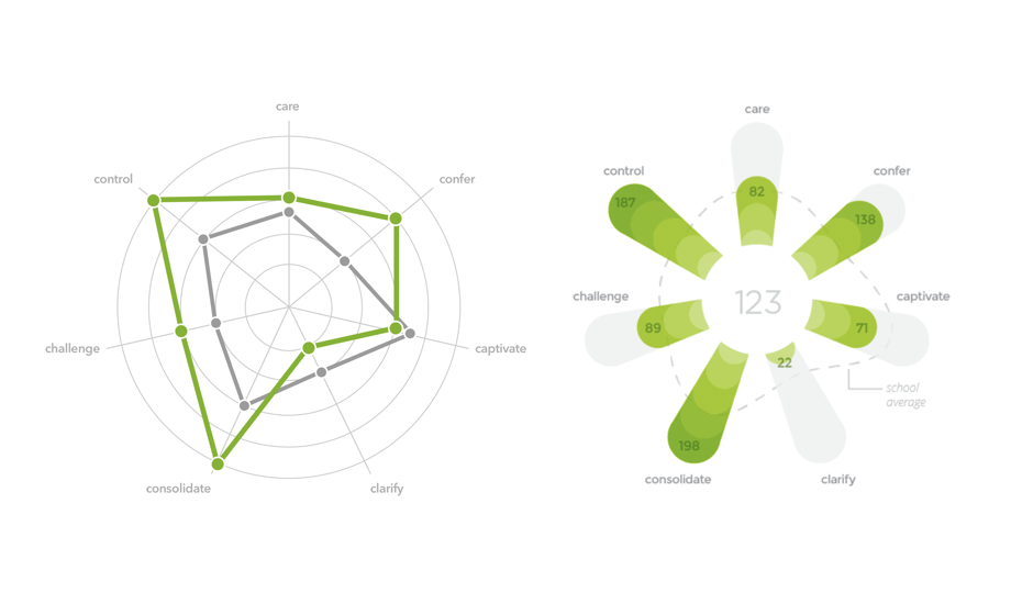
Fig 1: Precise and matter-of-fact, or friendly and encouraging?
The image on the left is a spider chart, sometimes known as a radar chart. In this example, values for 7 variables are mapped onto circles centered around a zero point. Although spider charts are not as common as bar graphs or line charts, most viewers should be able to decode the values, expending perhaps a little effort. Spider charts are useful because one chart can easily be compared with others based on the shape of the outline:
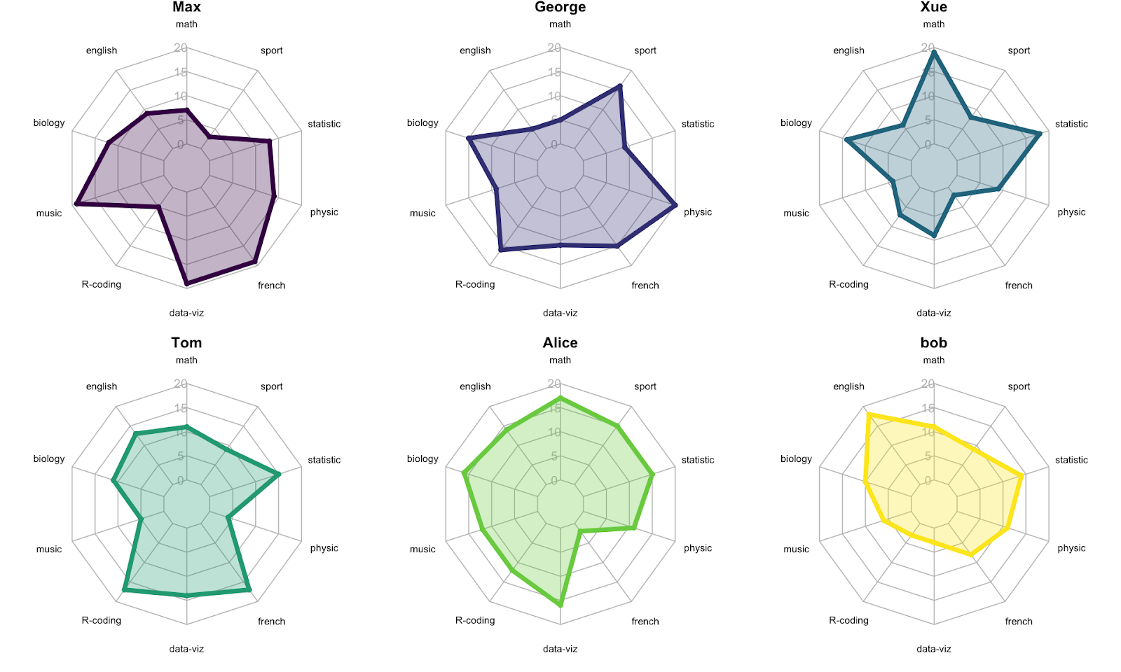
Fig 2: Spider charts facilitate shape comparisons (https://www.data-to-viz.com/caveat/spider.html)
(Yan Holtz, incidentally, on his blog From Data to Viz offers a nice discussion about the pros and cons of spider charts)
The variant on the right in Fig. 1, drawn in a green floral pattern, displays the same data as the spider chart to its left, but is intended to be encouraging and less threatening for the viewer. Such a design may be preferable in situations like this, where performance ratings are being reported to teachers. Teachers may naturally find a report on their performance anxiety-provoking. Although it sacrifices some precision, the green floral version attempts to suggest to the viewer that the values being represented are not fixed but can be improved over time.
What do you want your user to focus on?
Let’s say you are working on a chart design and would like to make the key insight more prominent, so it’s easier for people to notice it.
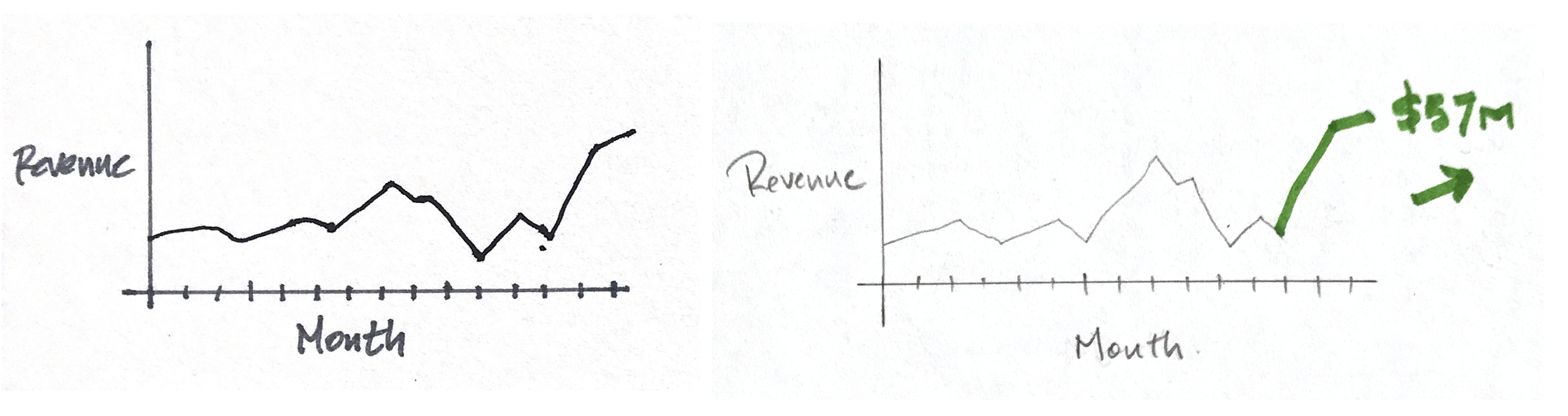
Fig 3: Should you highlight an insight?
The time-series chart on the left of Fig. 3 shows a value (in this case revenue) plotted as a function of time. In the alternate design on the right, similar values are plotted, but the latest values and a prominent trend arrow are highlighted in a green color, drawing the user’s attention to the fact that the recent trend is increasing, likely a positive indication for the person viewing the chart.
The redesign would seem to offer the user a more efficient insight than they might have gotten by looking at the more basic chart on the left. So, that’s better, right?
Perhaps. What if anything are we trading off, to get the benefit of a quicker insight in the redesigned chart?
Well, first off, let’s recognize that we are making an assumption — namely that we believe the user wants an efficient insight highlighted for them. This might seem to be a pretty safe assumption, but it may not always be true.
What insights are most valuable to our user?
What problem are they trying to solve?
What questions are they hoping to have answered?
Consider that the user in this situation may instead be interested in understanding the volatility of the data — how noisy is it? Does it have a lot of ups and downs, from month to month? If so, what might be causing that volatility? Why is revenue sometimes up, sometimes down?
Framing the user’s question in this way — how volatile is our revenue, by month? — could in fact constitute a different use scenario than helping someone understand whether the recent revenue is trending up or down. Same data, perhaps, but a different use case for that information.
If the user is trying to understand volatility, would the right-hand chart be more effective for them, or less? The only way to know for sure would be to do some user testing. We could certainly hypothesize, though, that the one on the left is likely to be more helpful because, without the green color, it may be easier to follow the up-and-down trajectory of the time series chart without being distracted by the bright green numbers and highlighted trend line.
So, a tradeoff — helping someone see the recent trend may make it a little harder for them to focus on longer-term volatility in the data. And vice-versa.
Once you recognize that most product decisions likely involve weighing tradeoffs, you start to think not in terms of trying to achieve a perfect design, but rather making mindful decisions that find the right balance for your customer and what they are trying to do.
Product design always requires gathering knowledge — or at least making informed guesses — about your customer’s intent. Designing informational tools or data products even more so, given how many information-display options can be employed. Always act on the best information you have about a user. What cognitive task are they likely to try to accomplish with your product? Structure their information experience accordingly.