Dashboard
Tripod Education Partners, a Cambridge, MA-based startup, administers surveys to gather, organize, and report on the student perspectives of K-12 students. We helped design Tripod’s data reports for teachers and administrators, as well as an online platform for teachers to personalize and manage their own surveys.
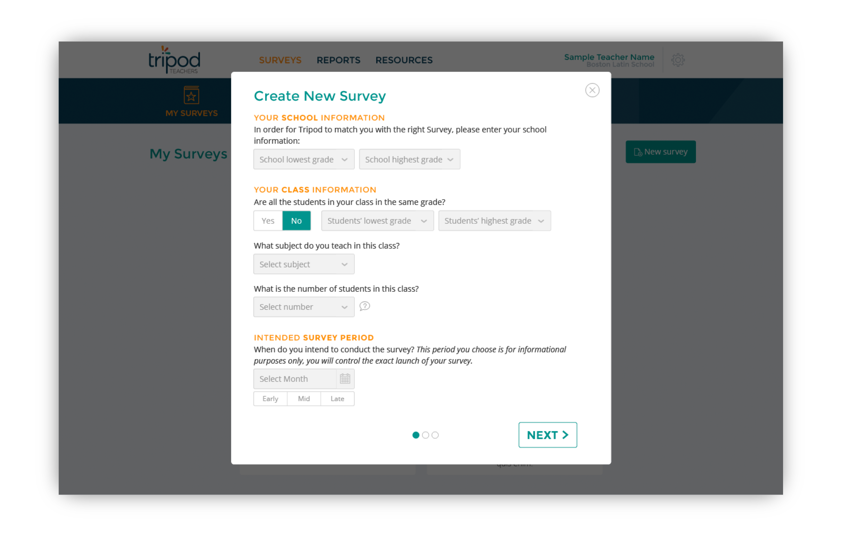
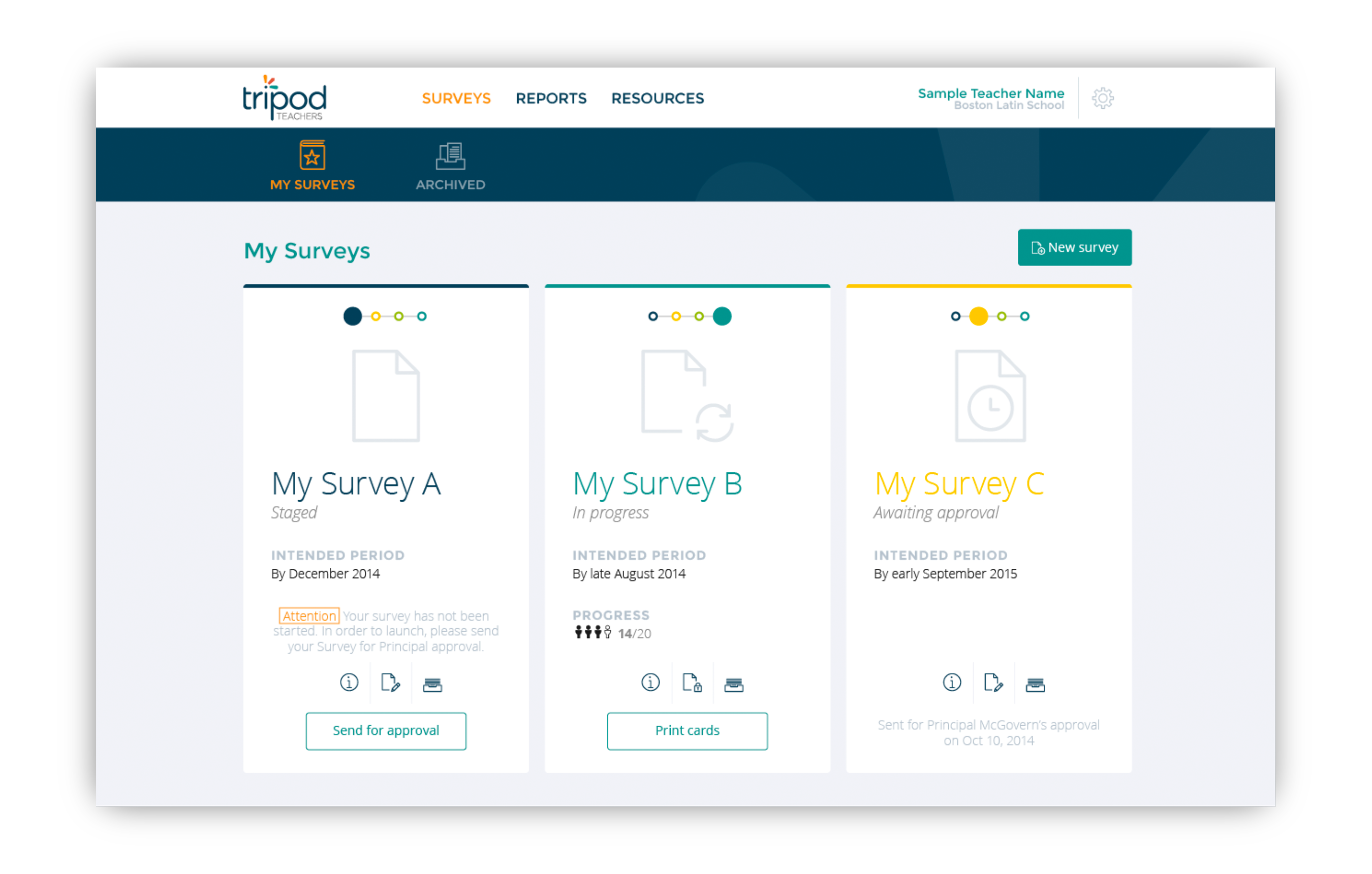
— Survey Dashboard (Teacher Portal) —
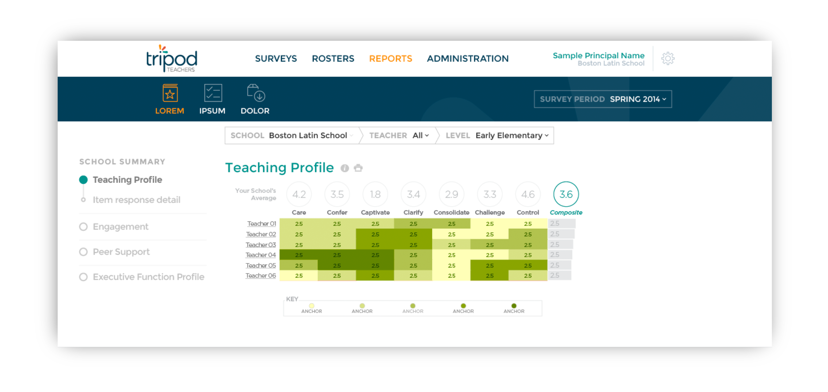
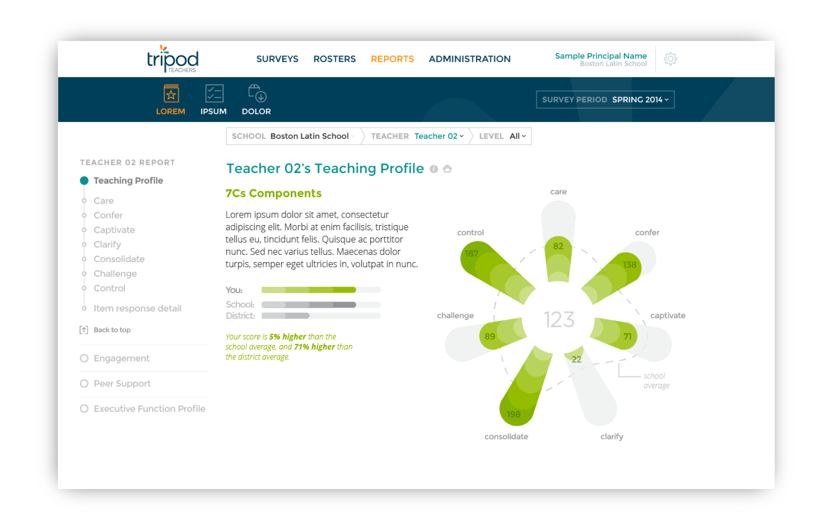
— School Report (Principal Portal) —
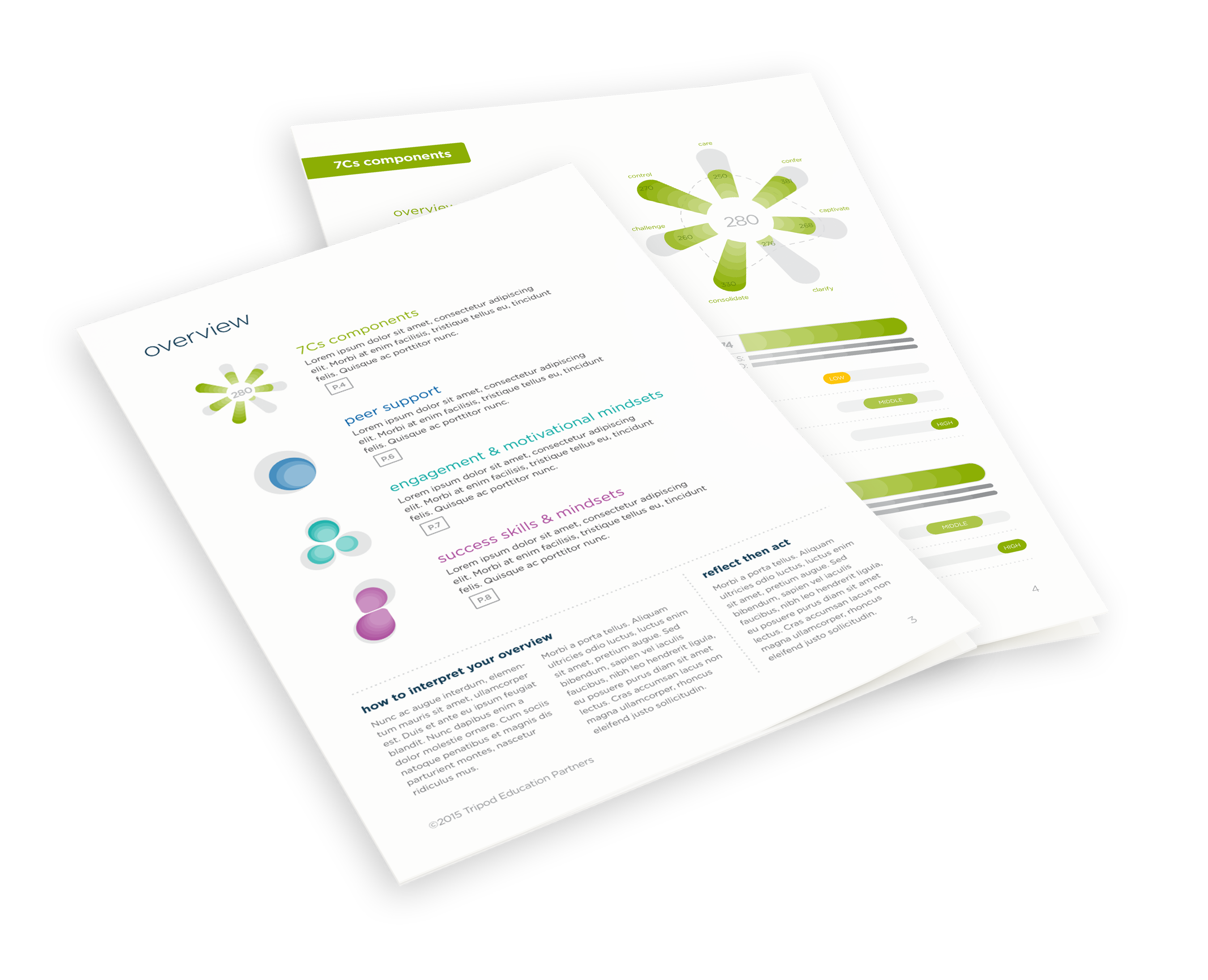
— Teacher Report (Paper) —
Problem
Switching from the existing paper-based reporting system to a new online platform required changes to both the process and format of report creation and delivery. Teachers needed to feel comfortable using the new system on their own, from launching a survey to visualizing the results.
Additionally, many teachers were anxious about receiving feedback from their students. As a result, we felt that ease of use and empathy were major challenges that needed to be addressed in the design.


Major Focus areas:
- Ease of use for teachers
- Emphasis on growth and development, so teachers are motivated to improve classroom learning conditions for their students

Approach
We conducted workshops with the Tripod team to understand their strategic goals, model existing processes, and review the current report design. Based on what we heard, and feedback Tripod had previously collected from teachers and administrators, we all felt that the reports and self-service workflow had to be designed to empower teachers and to help them focus on how they can improve. It had to be friendly, encouraging, and intuitive.
During the conceptual design process, we created numerous sketches and design prototypes. Tripod team members critiqued and helped refine design concepts and frameworks. As the designs took form, we worked closely with the Tripod development team to evaluate the feasibility of various visualization designs, and to optimize the designs for ease of implementation.

The redesigned report was widely perceived as friendly and encouraging.
Solution
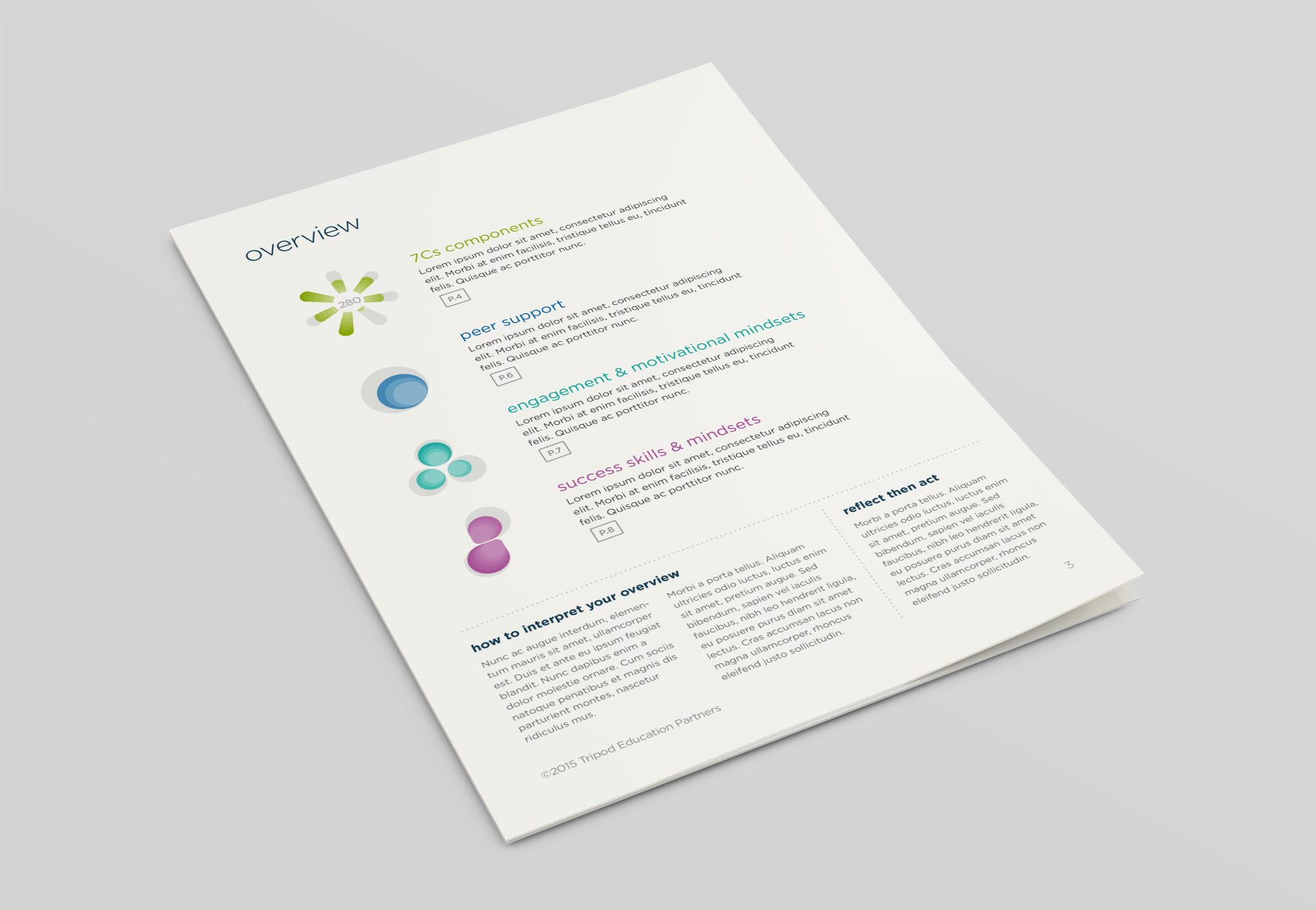
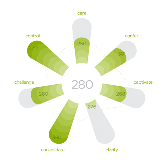
The redesigned report was widely perceived as friendly and encouraging. In the teacher reports, the survey results are framed as “strengths to share,” “areas to build on,” and “opportunities to grow,” reinforcing a focus on the positives and areas to take action. A multi-lobed leaf-like motif subtly suggests growth and professional development.
The design of the self-service workflow contextualized and broke down the process of collecting feedback from students into a few simple steps. The design makes it easy for teachers to see where they are in the process and know what to do next.
