04 Oct Weekly design challenges
At GroupVisual.io, we love a good design challenge!
To put our design thinking to work, we follow a weekly tradition.
We pick a random design challenge from a hat every week, and the designers tackle it individually. Inspired by Daily UI Challenge and reminiscent of design school critiques, we hold weekly pin up sessions where each designer presents their solutions in an informal setting.
Erin
Favorite challenge: To-Do List
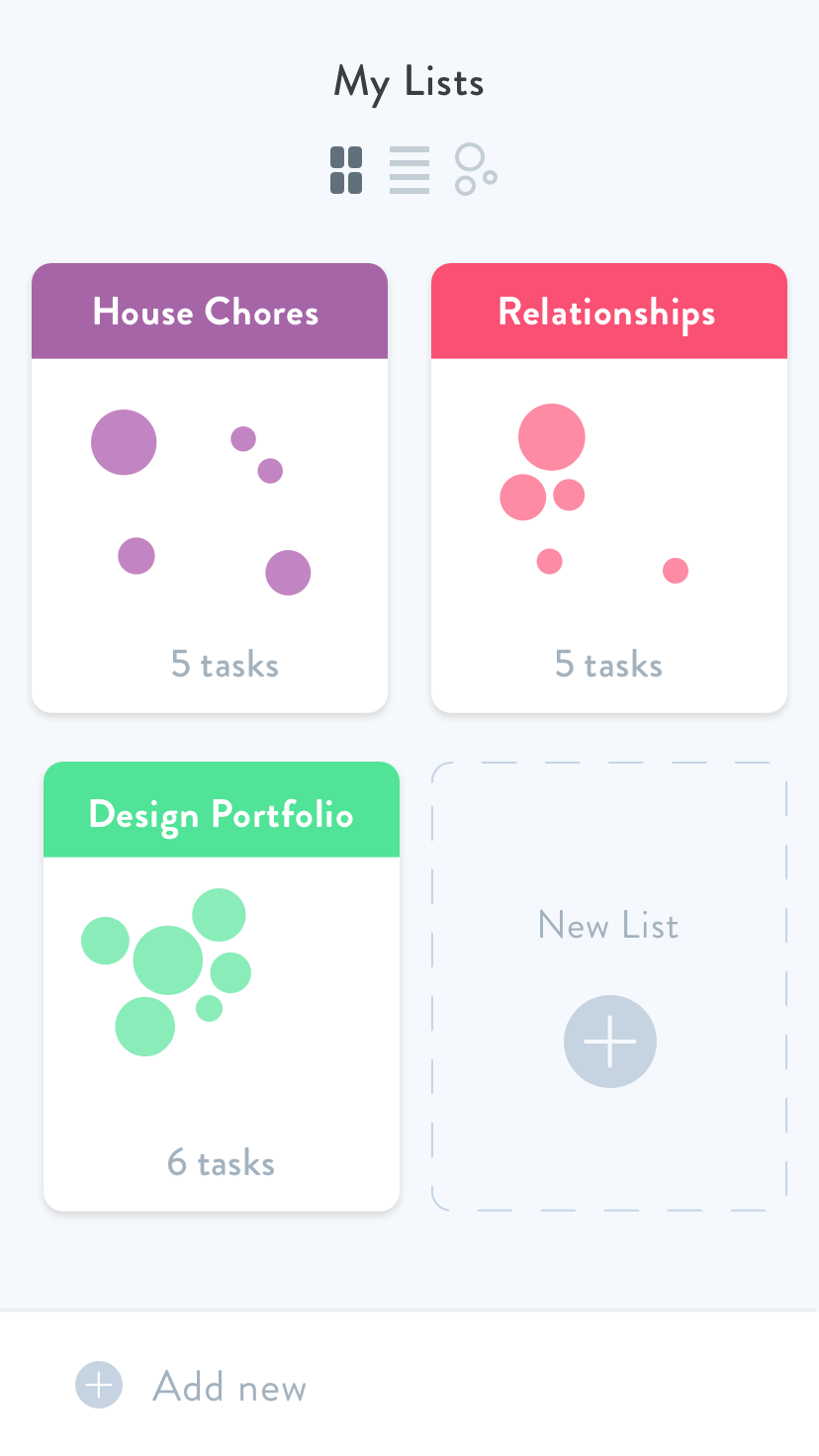
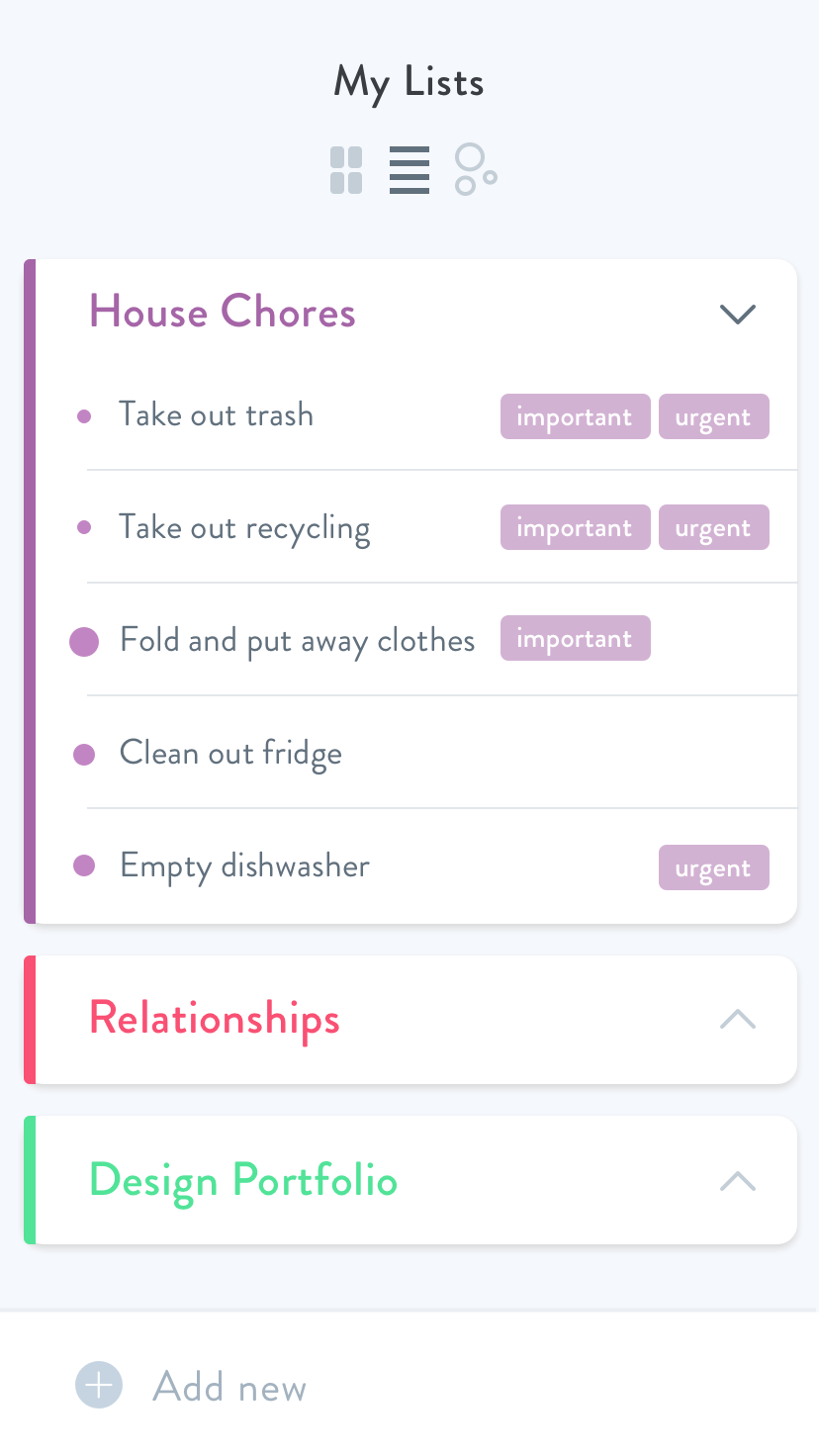
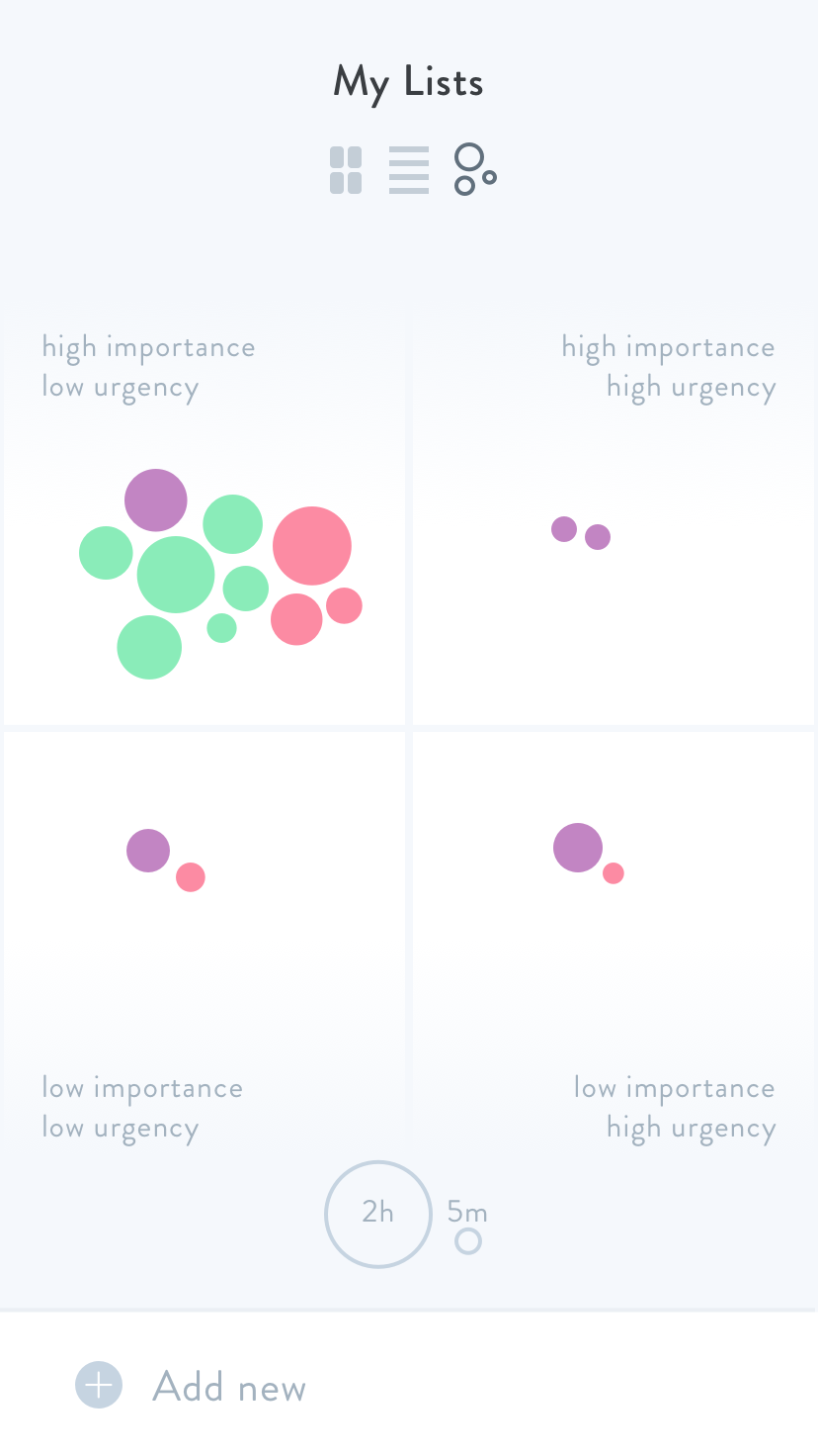

For this challenge, I was thinking about productivity and how people prioritize what they need to do. I categorized each task in order of urgency, importance and how much time it would take.
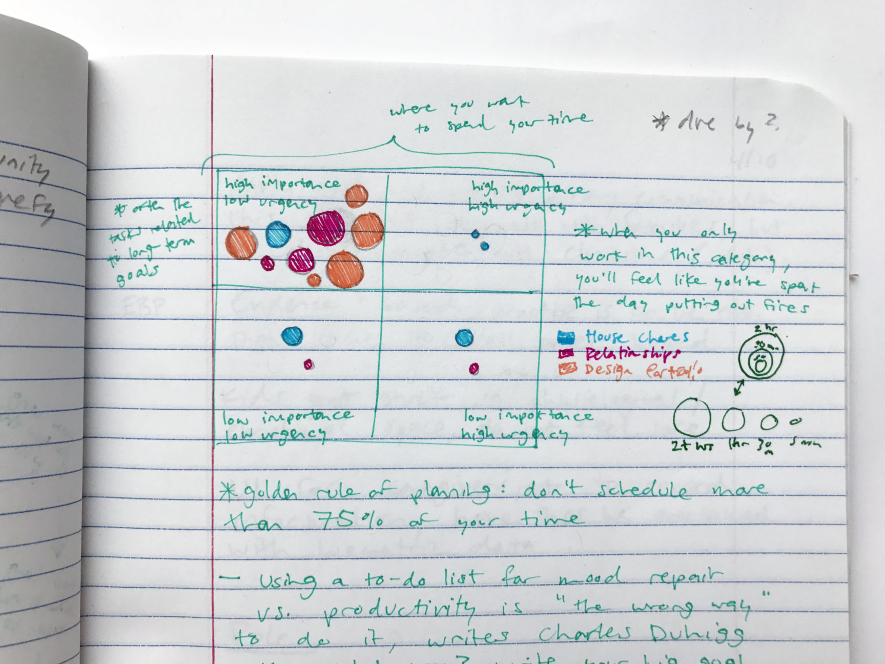

In a way, every design informs another. Even when two designs don't look the same, the process is similar each time. Refining hierarchy, clarity, and typography are some of the things I'm thinking about when I'm working on a challenge.
Lisette
Favorite challenge: Map
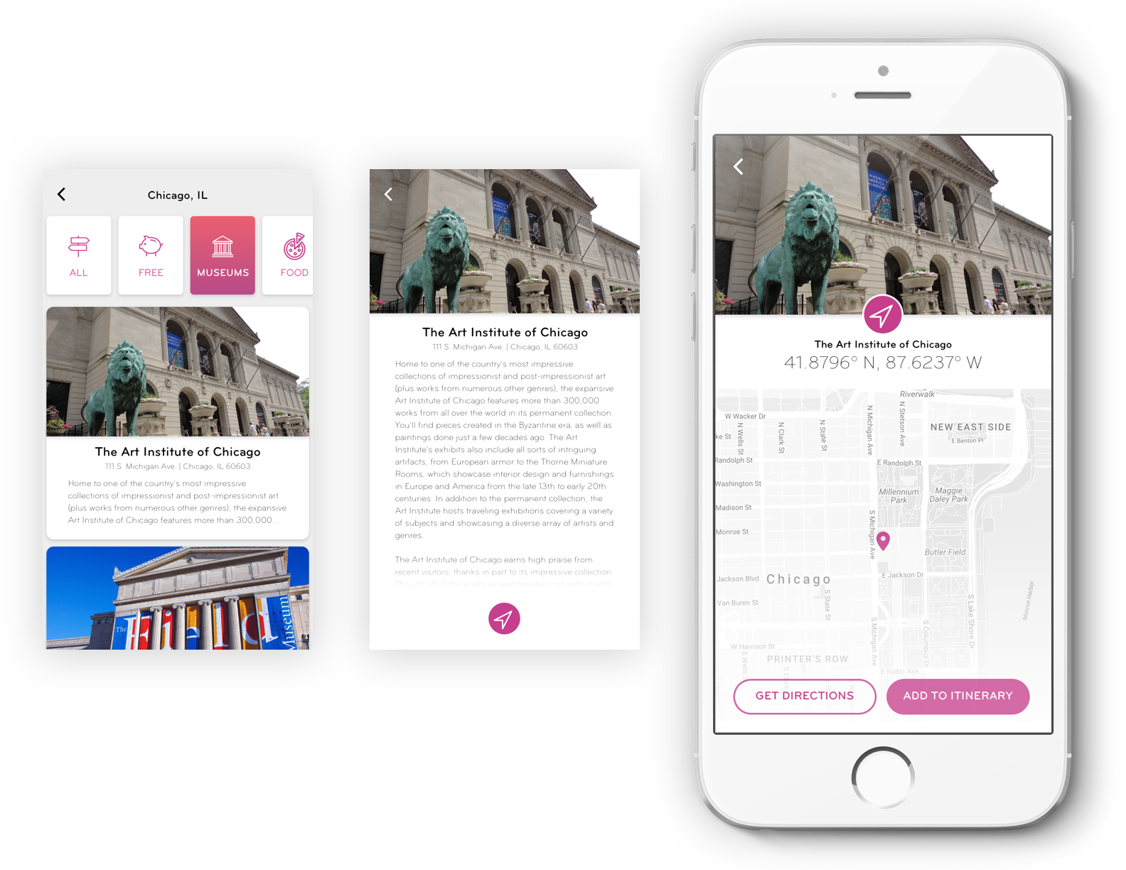

I loved working with real data for this challenge. When I was working on this, I was thinking: 'If this app was real, what would I want to do with it?'
It was a lot to organize, and in the end I was really happy with the design.
Luis
Favorite challenge: Workout App

In my imaginary scenario, I'm a person who travels a lot. And I want to know some nice areas where I can workout in a new place.
With this design, I thought about the whole experience. If I was tracking my workouts, what would I want to know? What do I want to accomplish?
Why do weekly challenges?
Luis:
We do these challenges because it’s a good opportunity to come together as a group.
Even though we’re solving the same challenge, each person has their own unique approach. It’s cool to see what people are inspired by, and how that can inform their designs.
What is your favorite part about weekly challenges?
Lisette:
Design challenges allow us to go beyond technical constraints. I don’t have to ask the question:
“Is the dev going to be able to implement this?”. I am free to try out different fonts, themes and colors without thinking about potential limitations.
Erin:
Our weekly challenges help me improve my visual design. It’s a great way to sharpen my skills. I also get the opportunity to redesign products that I use in real life. I do a lot with shopping and food related products, because those are my interests.
How have weekly challenges made you a better designer?
Lisette:
When I have the chance to explain the thought process behind a design, I learn from that experience. It puts me in the ‘UX’ mindset. I usually walk through where my imaginary user would start, and where they would end.
Erin:
Presenting my design is good practice.
We ask each other “what happens if you click this” and this gets us thinking about the process that we use for a client project. We think about where the design could go.
Where do we find design inspiration?
Erin:
My biggest source of inspiration for the weekly challenges is in the apps and products that I use on a regular basis. I’m always thinking about what I could do to improve them, or how I could personalize them to my needs.
Luis:
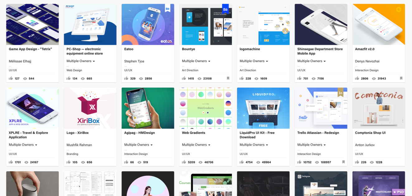
My go-to sites are Behance, Dribbble, and sometimes I even browse Pinterest for visual inspiration.
Some popular design resources:
